

PB Banter 8-27-2021

All charts are from or will soon be coming to checkonchain.com
Chit Chat is a project I’m a part of and equally excited about. The goal of the platform is simple: connect information seekers and providers with minimum friction. Currently compatible with both fiat and crypto for payment. Anons welcome to use it as well!
My public calendar if you want to connect one-on-one is here.

After a week off we’re back to some permabullish banter. Bitcoin sits below $50k, and NFT mania is in the air. Interesting times indeed.
Heikin Ashi is currently red, and price is up ~18% on a 30-Day rolling basis. The higher up we’ve gone, the weaker the moves up have been. Something to keep an eye on.
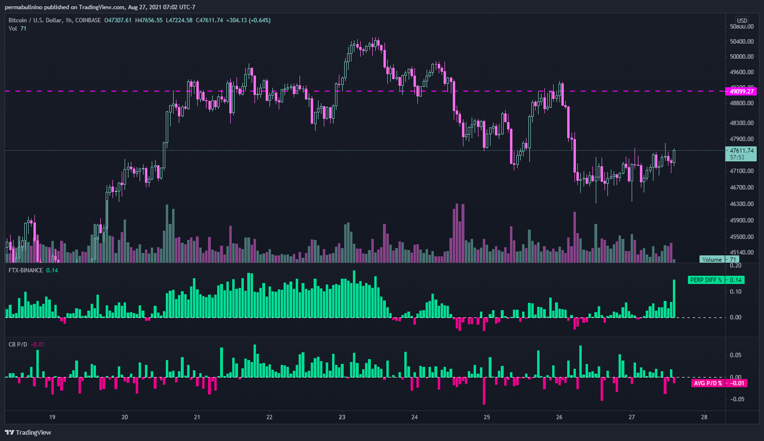
On lower time frames the perps premium on FTX vs Binance dropped off a cliff upon breaching $50k. With this came a drop off in the Coinbase spot premium vs other exchanges as well. As I’ve mentioned before - these are the exchanges I’d *generally* want to be long with. Want to see this look more constructive for upside.
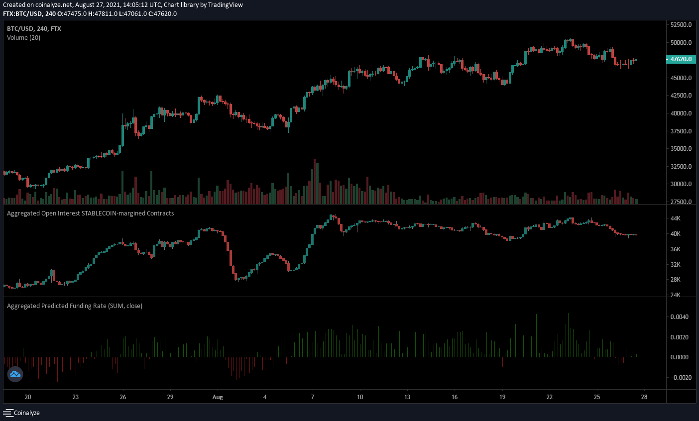
Let’s dig into why I want to be long with FTX. Notice anything interesting about the OI chart? Its shape is almost identical to the BTCUSD chart. For the doubters, lets look at Binance OI…

Besides a big short squeeze off the bottom, the Binance OI chart is flat, with a slight uptrend as of late. These dudes are along for the ride in my opinion, whereas the perps traders on FTX are aggressively making directional trades.
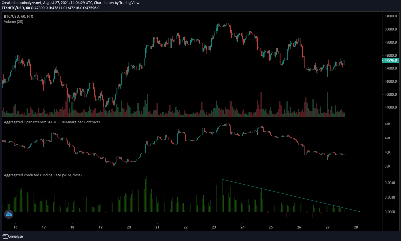
Now lets zoom in to the 1 Hr timeframe on FTX - OI and funding have been in a downtrend. OI has flattened out at these levels, and funding looks like it’s running out of downside. Looks good for some sort of move up from here.

I finally combined two of my favorite on-chain things to look at into a single chart:
Top half: 14-Day Market Realized Gradient. This shows spending behavior versus price action over a 14 day period. Similar to an income statement in some aspects.
Bottom half: Daily changes in Realized Cap. This effectively shows a snapshot of spending behavior on any given day. Similar to a balance sheet.
As you can see in bottom half, profit taking has ramped up a little over the past few days. However - the market realized gradient is printing green. This tells me:
Market Cap is still going up faster than Realized Cap
This means that NgU (number go up) faster than in-profit BTC holders are cashing out
Data leans bull as we sit around the mid $47k range. Seems like we could be in for an interesting weekend by the looks of it as well.
Until then - stay bullish.