Thinking Out Loud #2: Decred Charting Spree
Warning: Too long for email, probably better off viewing online
TLDR: Signs of profit taking over past month or two, profit taking slowing down, Treasury data looking strong going into DCP0006 activation
BRAIN DUMP:
It’s been a hot minute since I’ve written something about Decred (DCR), and there’s been a lot going on under the hood from an on-chain perspective. We’re in the thick of a raging bull market, and the DCRUSD + DCRBTC prices are up ~20x + ~5x off the lows respectively. DCP0006 (enable decentralized treasury opcodes) goes live within 24 hours, and it sounds like DCRDEX is coming to Decrediton in the not so distant future. All things considered - it seemed like the appropriate time to go on a charting spree and provide some longer form commentary. Into the chain we go!
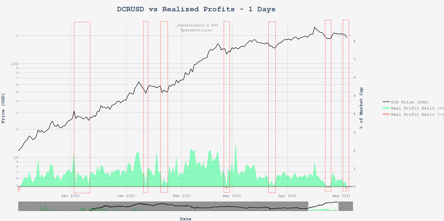
This chart shows the daily change in Realized Cap divided by the current market cap
The aim of the chart is to show the magnitude of profits (green) / losses (red) taken on any given day among network stakeholders
+/- 2% shows extreme values in profits / losses realized, and in many situations has proven to be places where price action reverses
Early 2021 was a period of large profit taking as can be seen with big spikes above 2%
Now lets zoom in on the previous chart and see if we can pull some edge from it
Throughout Decred’s entire move up from $11 - $200, all flat / negative prints in the Real Profit Ratio were good times to buy the dip
Profit taking spikes above 2% in February + March
Although a similar zoom in is not provided within, this was also the case in the early 2017 parabolic move up
HODL Power was a tool created to gauge fair valuation of the network over time by adjusting the Realized Cap upwards / downwards based on % of outstanding supply sitting within the ticket pool (i.e. staked coins)
Red line = Realized Cap value if entire supply was in tickets
Green line = Realized Cap value for current supply NOT in tickets
Realized Price (Realized Cap / Current Supply) is currently at $146, and we’ve yet to test it during this bull run
Historically the Realized Cap has served as the bull / bear line for DCRUSD
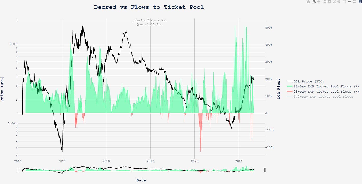
Flows to and from the Ticket Pool are worth monitoring for accumulation / distribution among whales
There have been a handful of periods where the sum of 28-day flows flipped negative: Early 2017, early 2020, and late March / early April of 2021
All 3 instances have resulted in neutral-bearish price action
Conclusion: not a surprise there has been a slow down in bullish price action as of late, a lot of signals pointing to profit taking among some holders
This chart is similar to the 28-day ticket pool flows, but also lumps on coins earned by miners and assumes that miners sell 100% of earnings
Not worth saying much more, but you can see how it provides a picture of natural buying / selling power within the network
Although price action hasn’t been nonstop up and to the right as of late, it’s interesting to see the shallowness of dips in this bull market
In 2021, the BTFD zone has been at flat returns over 30 days
Historically, the BTFD zone has been around -40% to -50% over 30 days
The next 4 charts are volume profiles for mining / staking data, and versus the DCRUSD + DCRBTC pairs
The mining VPVR shows on a weighted basis at which price levels the majority of hashpower has been contributed to the network
DCRUSD mining VPVR indcates that we’ve cleared all historical hurdles
Almost 90% of hashpower *ever* contributed to the network occurred below $40, signaling most ASICs accumulated around or below this level
The stake VPVR shows on a weighted basis at which price levels the majority of stake has been contributed to the network
DCRUSD staking VPVR indcates that we’ve cleared all historical hurdles
Almost 75% of stake *ever* contributed to the network occurred below $40, signaling most HODLers are in comfortable profit
The mining VPVR for DCRBTC indicates that only 18% of hashpower *ever* contributed to the network has occurred above .004
The stake VPVR for DCRBTC indicates that only 37% of stake *ever* contributed to the network has occurred above .004
The volume profiles in the previous charts illustrate economic weight thrown around at different price levels
However, we can also provide some more precise measures for this by creating an average lifetime price (only for staking provided, need to code out for mining)
The average DCRUSD price which DCR have entered tickets at is around $40 (no big surprise based on what we saw in the volume profiles)
The average DCRBTC price which DCR have *ever* entered tickets at is around .004
This line has had a lot of run ins with price over the network’s history, so not much of a surprise that we’re consolidating around this level
Staking comes with opportunity cost - and in crypto that opportunity cost is measured in BTC. This chart demonstrates that the opportunity cost is around zero for stakers since genesis - stake on dudes
The Strongest Hand is a metric that provides a fair value to the network based on aggressive ticket buying
“Aggressive ticket buying” requires (1) high USD prices, (2) high ticket prices and (3) high ticket volume to trigger an increase in fair value, all elements of high conviction bull market HODLing
The 56-day Strongest Hand was created by Checkmate as a middle ground between the 28 / 142 versions I had created myself (over time have realized this version has the most signal)
With all this mind - fair value made a huge shift upwards recently, implying that a 2x in price would be required for the network to move into overvalued territory. Bullish.
Now time to talk some turkey, I mean Treasury
The Treasury accumulates DCR via block rewards, and distributes DCR for billed contracting work
Chart above shows the net flows over a 30-day period, which currently sits at 10k DCR
At current prices, this means the Treasury has accumulated an extra ~$2M to fund future work
After almost 2 years of negative flows, the Treasury has achieved sustained positive inflows
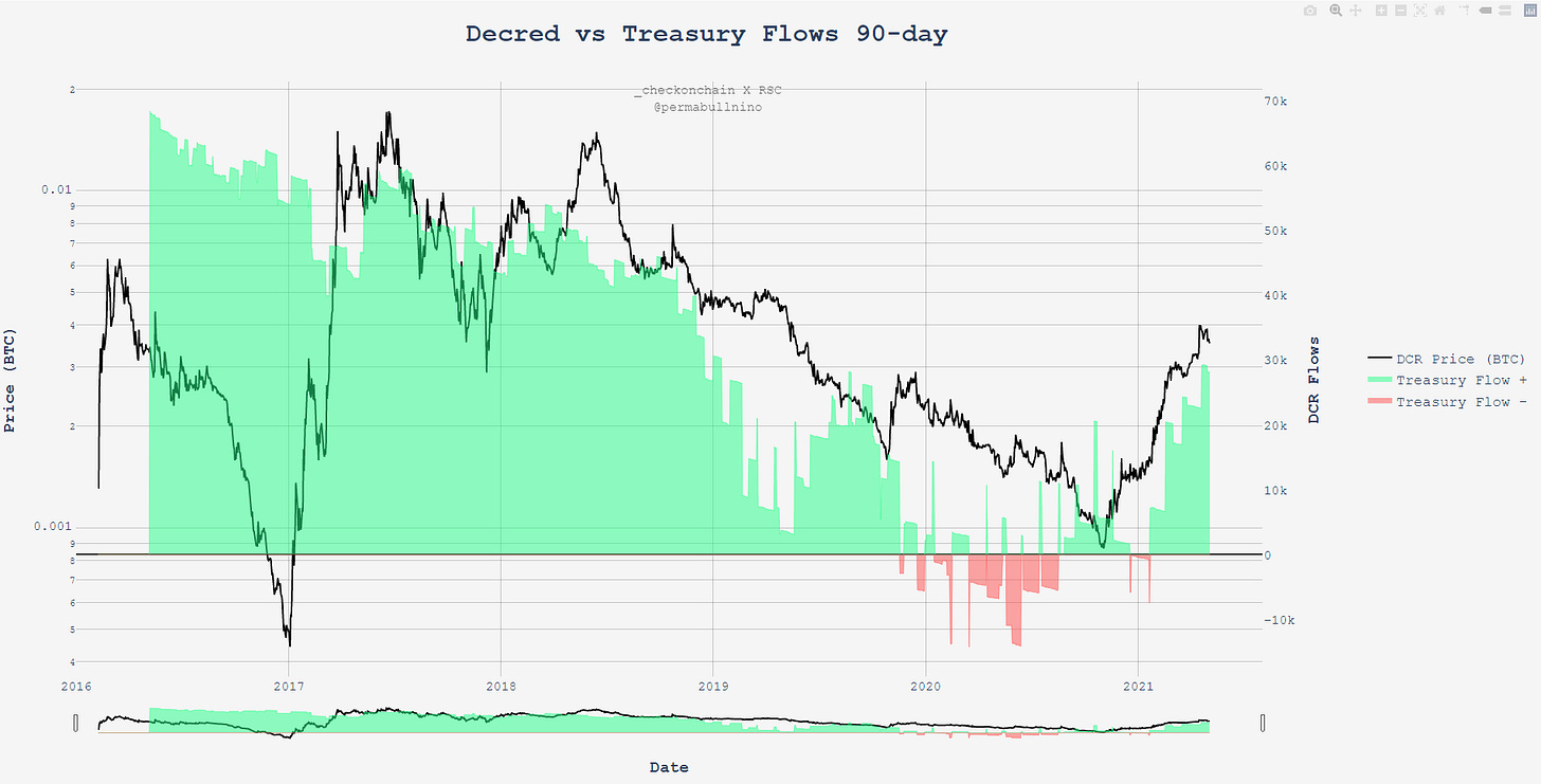
Tracking Treasury flows is another good way to identify selling power within the network - note how the first large red print in 2019 preceded a large leg down for DCRBTC
Same chart as above, except done on a 90-day basis
The Treasury has accumulated ~30k additional DCR over this time period
The Treasury has paid out a cumulative ~$11M to contractors since genesis, and the Treasury is currently worth $130M
Goal of contracting to work is to make the network more valuable over time, and as a function of this, the Treasury
$130M / $11M = 12x return on investment
Note that at the bear market lows the Treasury was equal in value to lifetime payments
The value of the Treasury keeps climbing and it looks like the monthly payments to contractors have decreased over the past few months
Current monthly spend is ~$200k USD
The combination of Treasury value increasing and monthly spends decreasing has given us a huge bump in projected runway for the project
As things currently stand, the network has approximately 491 months of funds before running out
491 months = 41 years of funding to build
Value of all coins *ever* paid to contractors TODAY = $86M
Cost basis of these coins = $11M
$86M / $11M = 7.8x return for contractors on coins earned, not a bad way to make a living!
Plotted above are the estimated number of contractors the Decred DAO could employ only using new block rewards (i.e. without eating into current Treasury Balance)
All values are at new all time highs, despite the fact that block rewards on a DCR basis are substantially lower than they were in the last bull market:
$25k Salary = 1,075 contractors
$50k Salary = 537 contractors
$75k Salary = 358 contractors
These contractor counts are exclusive, meaning they’re calculated assuming that you only have one equal salary for all contractors
Last but not least, we have a volume profile of all DCR moved on-chain over the past 180 days
Elevated volumes since February 2021
~60% of DCR moved in the past 180 days took place above $140 - impressive considering price has only been above $140 around 40% of this time period (~75 days)
I like to look at metrics like this to identify areas where a lot of coins have changed hands, can help spot future support / resistance in the future
This ended up being way longer than I expected, but hopefully for the Decred enthusiasts / the Decred-curious this was a fun read. For more charts hit up checkonchain.com. Until next time!


